
Logo

For the logo I made a very minimalistic drawing of a seagull, I’m not sure what my inspiration was for the style and final design but, I think it might be a subconscious mash of the linux logo, the seagulls from finding Nemo and Feathers McGraw (the menacing red glove wearing evil penguin from Wallace and Gromit). then i tried leaving out as much of the detail as possible without loosing the immediate idea of “yeah that’s a seagull”.

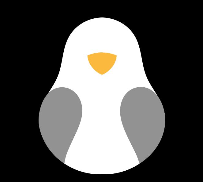
Tux the penguin, mascot of Linux (1996) 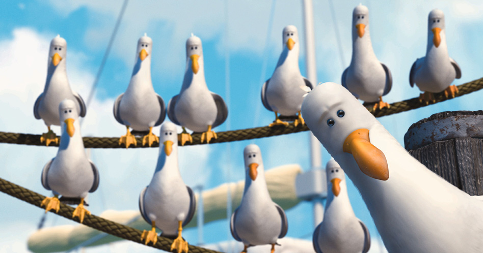
the seagulls from Finding Nemo (2003) 
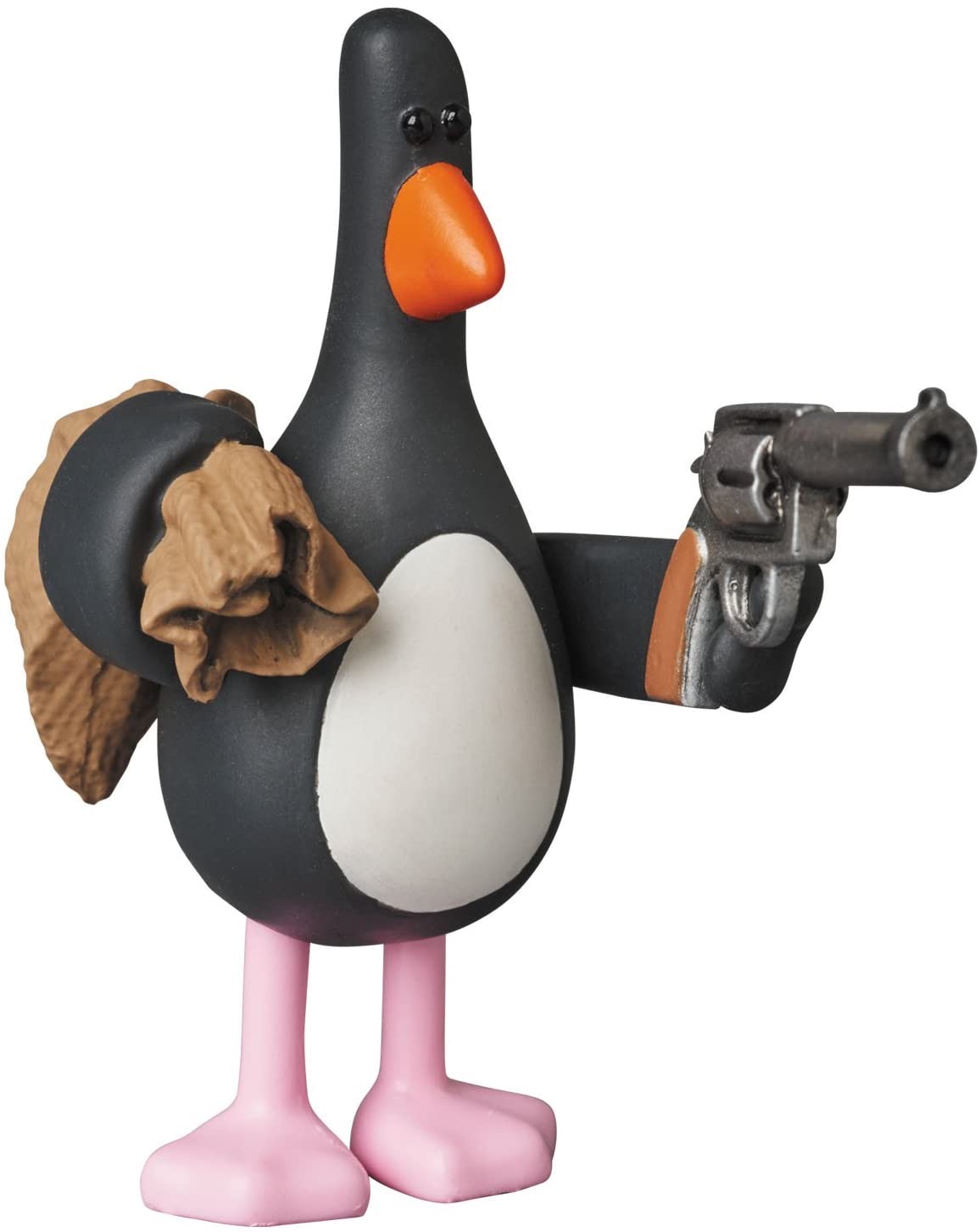
Feathers McGraw (1993)
I chose a very minimalistic approach as it seamlessly blends in with almost all other styles I think I might want to integrate it into in the future, I also changed the accent colour of my website from a dark greenblue-ish to the orange of the beak (#ff9231) to create a more unified feeling all across the website.
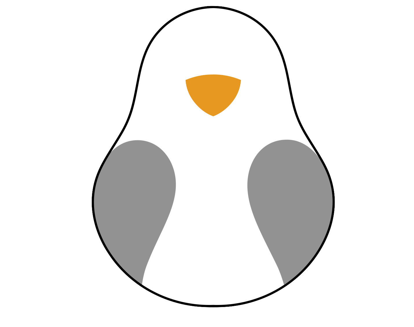

For the actual logo I took out the black background however as the background of the posts on my websites are already white it would take away the bird shape. I have also tried using an outline around the white shape instead of a black box however i am personally partial towards the black background as i think it is a bit easier on the eyes.
The options


i can give a concrete reason why i did’t choose some iterations however some of the choices was just a personal preference, in a professional setting that would of course not be a good enough reason and you’d leave the personal preference to the client however seen as i am making this logo for my own project that kinda makes me the client and in this case i think for some of the choices is a valid enough reason.
I settled on the bright orange beak with the lighter gray wings because the lighter orange almost seemed a bit dirty to me, like a parasol that has been out in the sun for just a bit to long. i choose for the lighter wing colour as the dark one was just to dark, i wanted it to look a bit lighter and more of a tone in the middle of white and black instead of just a lighter shade of black.
Profile Picture (Teams)
after deciding on my logo i made a standard Profile picture, i based it on the measurements of the teams profile picture which is 100X100 pixels and used the logo with thew black background to it. its realy small bbut thats all you need really.
