

Mood-board choices and logos

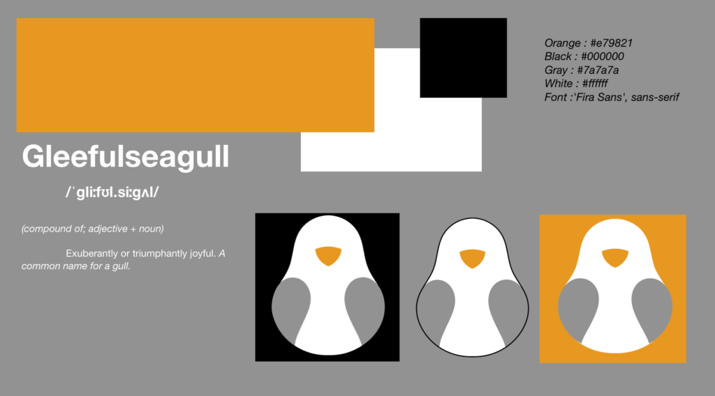
when i started thinking about my logo and what i would want it to look like i immediately had the idea of the simple bird shape, i decided that it would be a easily distinguishable that wouldn’t be to difficult to scale up or shrink. i thought about making a slightly more realistic seagull from a side perspective but ultimately decided against it as it would be difficult to do in the simplistic style and would pose a problem when adapting it to different use cases. also it would be a lot more difficult to really nail the shape of a realistic bird and i thought it would be a bit different and give it some personality as supposed to a regular seagull shape.
once i decided upon the general shape and idea i thought about what colours would fit well. My first thought of cours was grey white and orange just like a seagull, the use of black was also a obvious one, it would fit wel with the white and grey and provide a contrasting legible colour for text. I chose the orange as a contrast colour for the website because it is a bright colour that provides a good change of pace to the rest of the black and white colour schema without making the website to loud, i also did some research on accessibility concurring orange, black grey and white and it didn’t seem to be a common problem. as a person with dyslexia myself i know the importance of fonts, colours and what influence they can have on the ability to read the text and picked a font and colours i can easily read.
Deciding my demographic was easy. the website is specifically created to be a place to keep track of my progress and publish my work so my demographic is me, my teacher, class mates and people who have so little to do with their life that they decided to put “https://airybubbles7.nl/gleefulseagull3” in as a url and waist time looking at my IT assignments (please go do something useful with your time (: ). so the specifications that fit that demographic are also quite clear, it needs to be a place i can express my ideas and thought process in a some what organised and legible fashion.
- English
- Different categorise
- legible for someone with dyslexia
- a reasonable amount of technical Jargon
In general the website, logo, colours and fonts are designed for my enjoyment and ease of use which in my opinion is only fair as it is after all my website for my projects and their is there for no use in pretending its not made by me.